
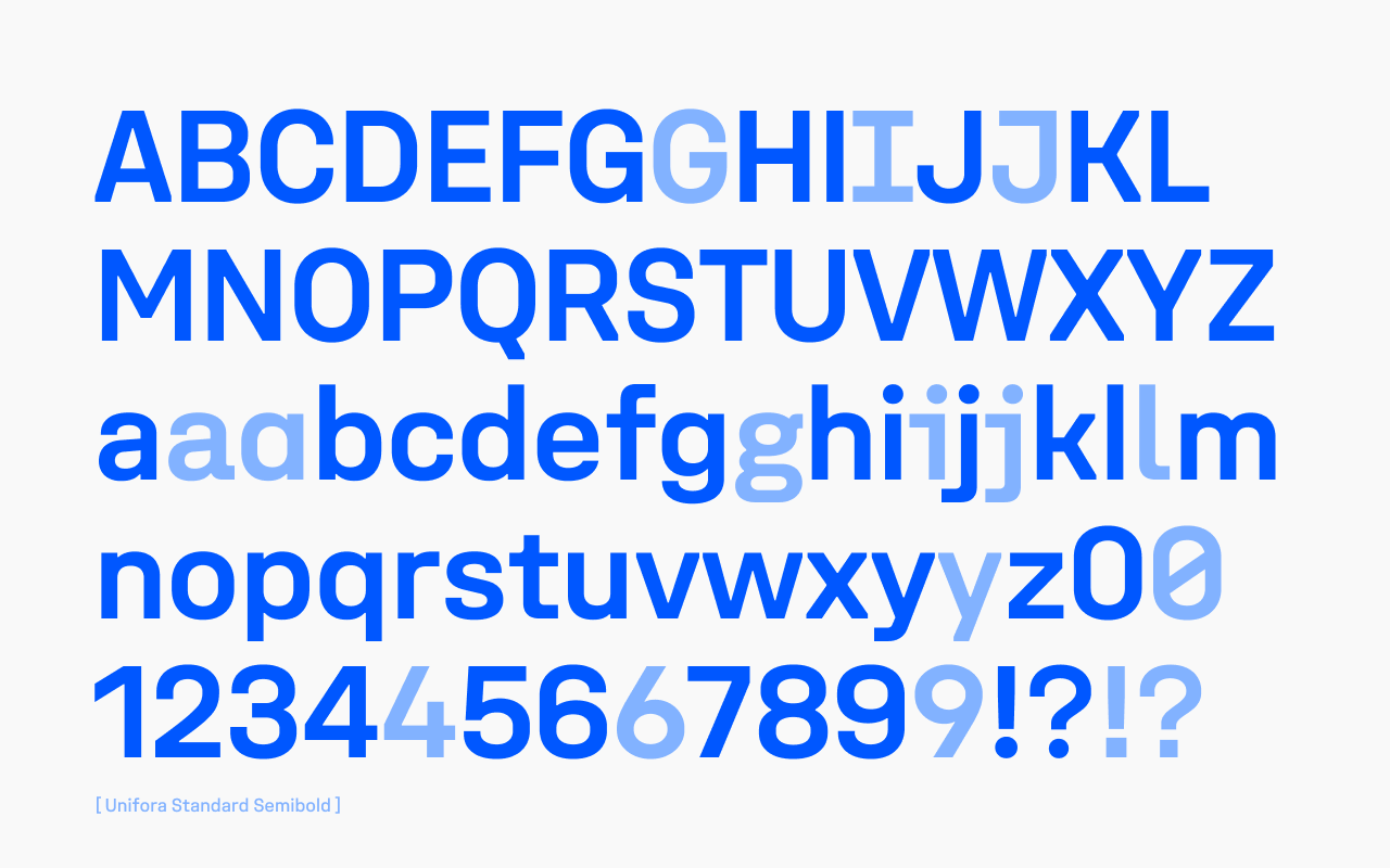
Unifora is a sans-serif superfamily released by Yep! Type Foundry in 2026. It starts where DIN leaves off—taking the constructed logic of technical lettering and pressing it through the demands of modern screens. Industrial in spirit, optimized in execution: calibrated vertical metrics, pixel-grid alignment, and punctuation that centers itself optically against figures.
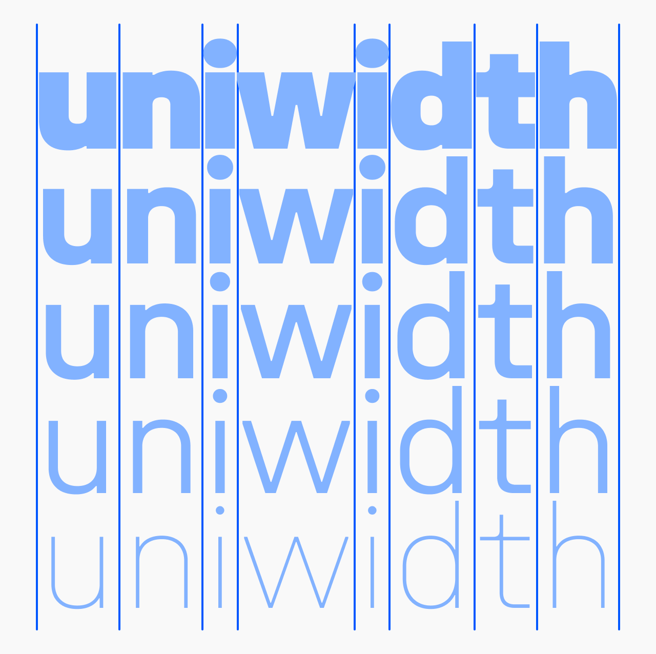
Built around a uniwidth system: within each of the five width variants—Condensed through Expanded—every character holds its advance width across all weights and styles, so layouts never reflow when weight shifts.
Made for interfaces, data displays, and responsive layouts that need to hold together across sizes and contexts.
Unifora is available as 5 widths—Unifora Condensed (75%), Unifora Narrow (87.5%), Unifora Standard (100%), Unifora Semiexpanded (112.5%), and Unifora Expanded (125%) — plus the complete Unifora superfamily that bundles all five. For a quieter register with the same design sensibility, Yep! also offers Innovator Grotesk.
At a glance
- Superfamily: 135 static styles (5 widths × 9 weights × 3 styles: upright, italic, retalic) + 1 variable font with three axes (
wght,wdth,slnt). - Per-width subfamily: 27 static styles (9 weights × 3 styles) + 1 variable font with two axes (
wght,slnt). - Five named widths: Condensed (75%), Narrow (87.5%), Normal (100%), Semiexpanded (112.5%), Expanded (125%).
- Nine weights: Thin (100) through Black (900).
- Slant axis range: −18° (Italic) to +18° (Retalic)—both directions, fully continuous.
- Uniwidth design: within each of the five width variants—Condensed through Expanded—every character holds its advance width across all weights and styles. A Condensed Bold and a Condensed Thin paragraph occupy exactly the same column width—the weight changes, the metrics don't.
- x-height: 70% of cap height.
- Language support: over 250 languages using the Latin script.
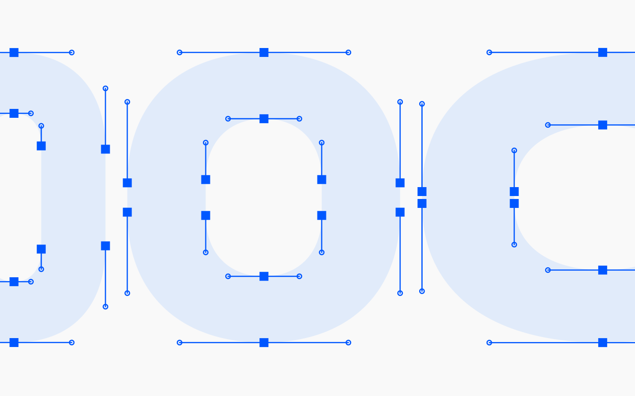
- OpenType features: 3 stylistic sets, 11 character variants, tabular figures, slashed zero, case-sensitive forms, discretionary ligatures, and ordinals.
- Essential UI icons.
![Unifora at a glance — 12 feature icons: 3 variable axes (layered O showing weight/width/slant), Uniwidth (S between vertical guides), Slant [−18°:18°] (m shown at both slant extremes), Corner cuts, Square punctuation (i!i! default vs square dots), High-legibility set (I and l default vs serifed), Character alternates (three a variants), Ordinals (1ª), Tabular figures (O and 1 between alignment guides), Case-sensitive forms ({H}), Ligatures (ffi), UI icons (command symbol).](https://cdn.fontdue.com/yeptype/images/2257681988125747353/at-a-glance.png?v=63943323867)
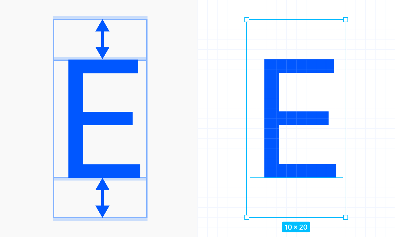
Vertical metrics and rendering
Unifora’s vertical metrics are calibrated so cap heights land on the pixel grid in standard-resolution contexts. Text labels sit precisely centered against icon glyphs and button containers at calibrated sizes.
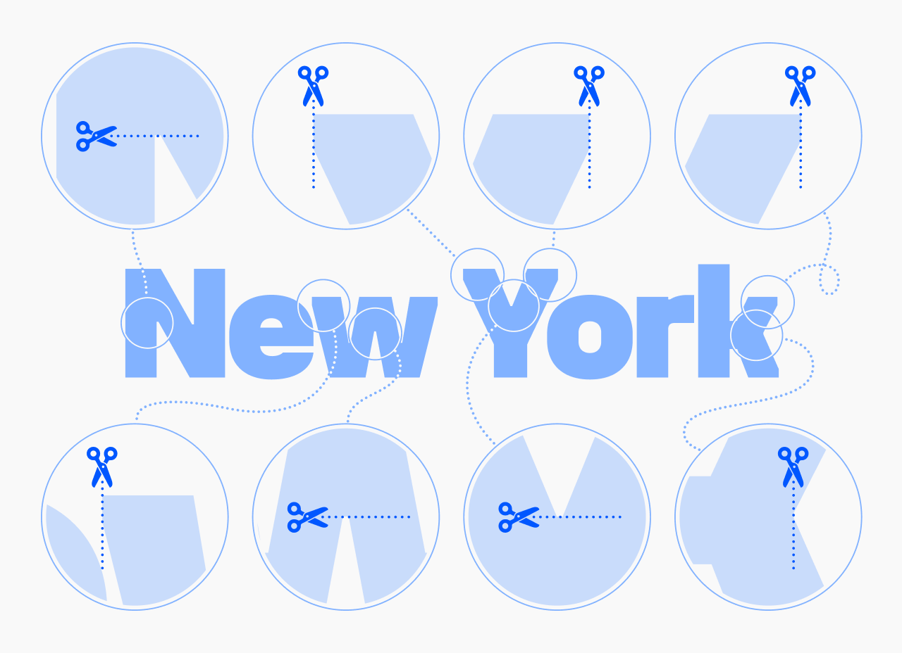
An industrial edge, architectural precision
Unifora starts where DIN leaves off. It takes the constructed logic of technical lettering—the geometry, the precision, the lack of ornament—and presses it through the demands of modern screens without softening the edges.
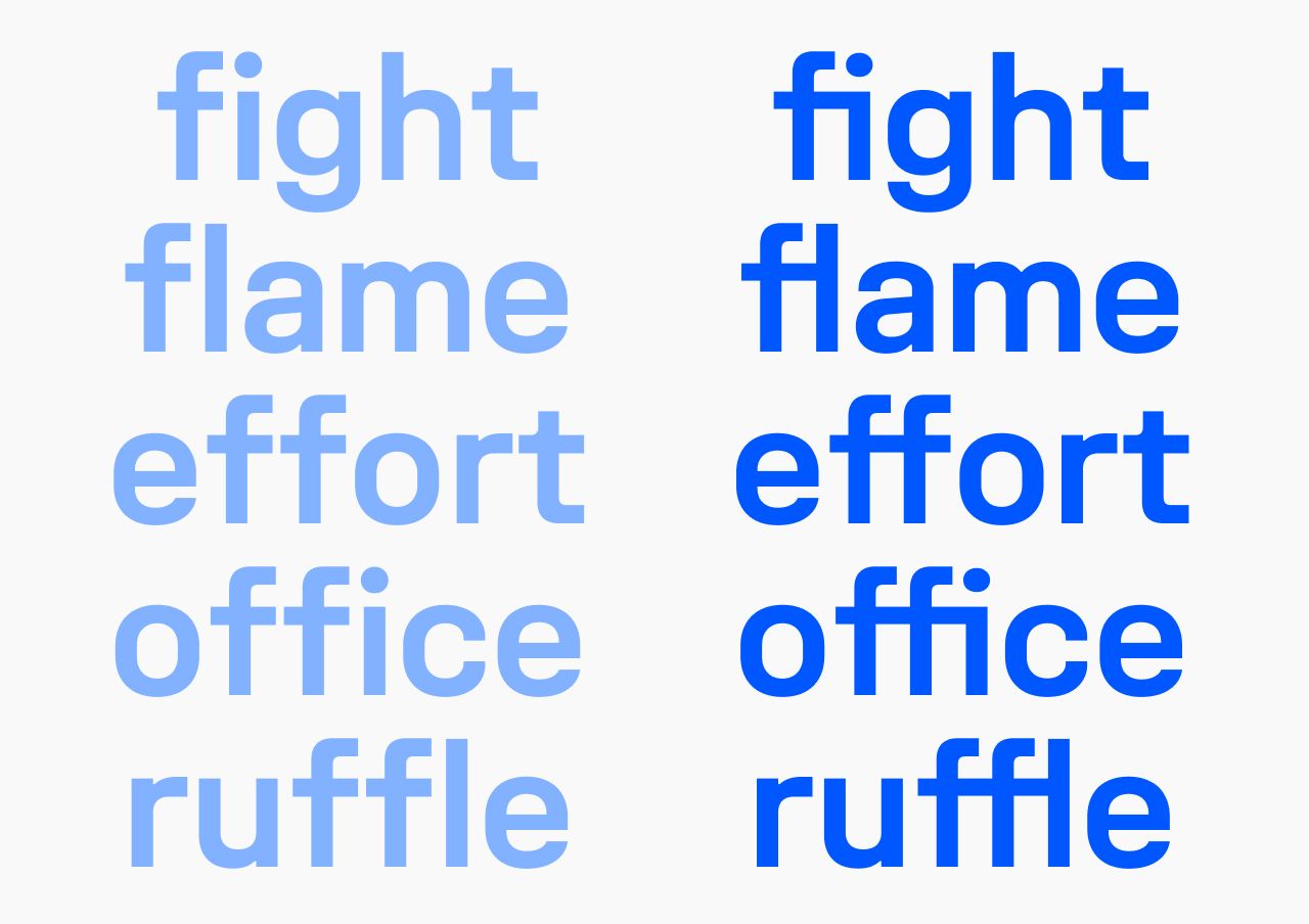
The corner cuts aren’t just decoration. Uniwidth spacing is tight by nature, so those cuts carve out breathing room where characters would otherwise collide.
The uniwidth idea
Most variable font families treat width as compression or expansion to taste. Unifora takes a different position: width is a design parameter, not a layout variable. Each width variant is its own uniwidth system: within Condensed, every character holds its advance width across all weights and styles; within Expanded, same principle. The characters change—they breathe in Expanded, they’re tight and efficient in Condensed—but switch from Thin to Black within any given width, and the column width doesn’t move.
Getting there wasn’t simple—see on uniwidth font design for what actually broke along the way, from spacing at the weight extremes to kerning that has to hold across every master.
The extended slant axis
Most italics stop at 12°. Unifora goes to 18°—and it goes both ways.
The slant axis (slnt) runs from −18° (Italic) to +18° (Retalic). Italic is the familiar right-leaning slant; Retalic is its mirror—a leftward slant, more technical in character, suited to motion contexts and certain display applications. Both are oblique-style: letterforms don’t change shape, only angle.
Intermediate values—−9°, 12°, anything in between—are fully valid via font-variation-settings. Custom slant angles as static fonts can be generated on request.
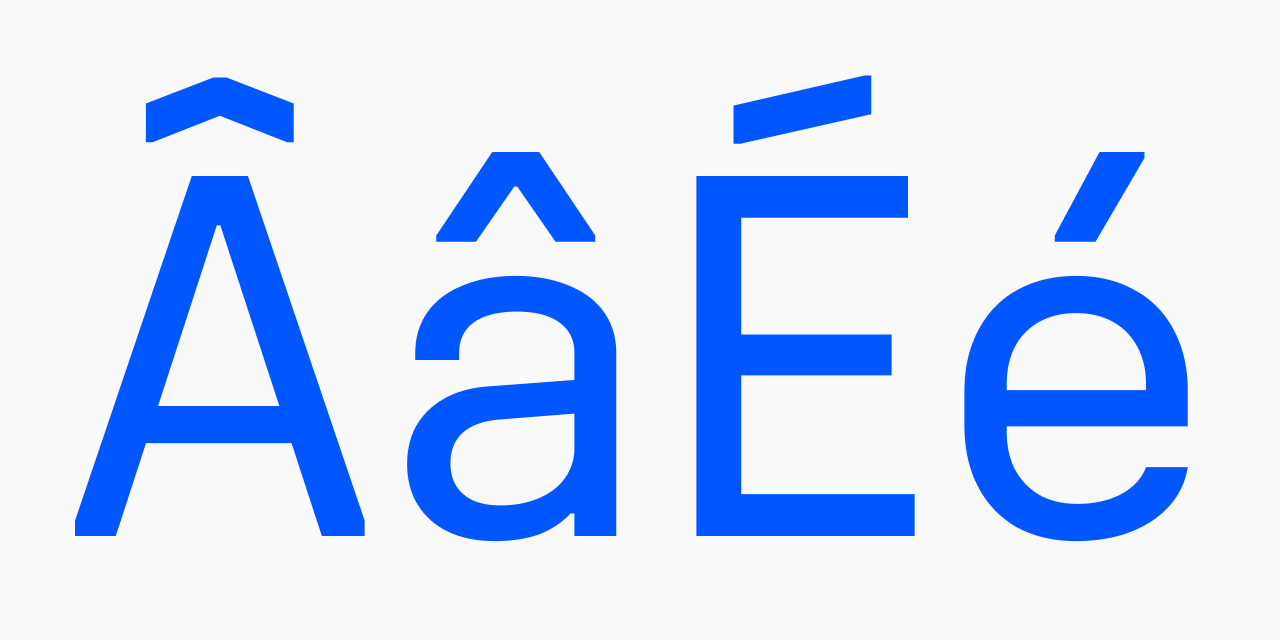
Diacritics
Diacritical marks above uppercase letters are drawn at a reduced height. This keeps line spacing comfortable in all-caps text without requiring manual leading adjustments.
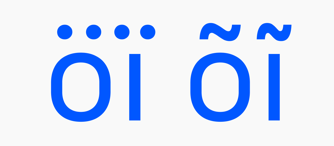
The letters ī, ĩ, and ï use condensed mark forms—narrow enough to sit within the tight proportions of the dotless i without crowding its neighbors.
Recommended uses
Data-dense UI
Uniwidth stability, tnum figures, smart numeric punctuation, and the Condensed width combine to make Unifora unusually capable in dashboards and tables where content must hold stable across states.
Brand systems across multiple contexts
Outdoor (Expanded reads at distance), digital UI (Condensed is efficient), print (Normal is comfortable for body)—one family handles all of it coherently.
Technical and industrial contexts
IT, engineering, logistics, production, construction, transportation: the DIN starting point, refined for modern screens.
Wayfinding
With the high-legibility set (ss02) active, character disambiguation makes Unifora a strong choice for signage and information systems. The default closed-aperture forms aren’t ideal for road signage with strict legibility requirements; enabling the high-legibility set addresses most other wayfinding contexts.
Motion and kinetic typography
Three axes animating simultaneously—weight, width, and ±18° of slant—cover a wide range of expressive motion. The design space was built for it.
Not recommended for
Humanistic, organic, or playful design directions—hospitality, children’s products, soft luxury goods.
Web development
Important note: store font files on your own server or a CDN you control. Do not upload them to public repositories—font files in a public GitHub repo are effectively unprotected, regardless of licensing.
Loading the full variable font:
@font-face {
  font-family: "Unifora";
  font-display: swap;
  src: url('/fonts/Unifora-VF.woff2') format('woff2');
  font-weight: 100 900;
  font-style: oblique -18deg 18deg;
  font-stretch: 75% 125%;
}
Loading per-width sub-variable fonts:
@font-face {
  font-family: "Unifora Condensed";
  font-display: swap;
  src: url('/fonts/UniforaCondensed-VF.woff2') format('woff2');
  font-weight: 100 900;
  font-style: oblique -18deg 18deg;
}
Use font-variation-settings to address axes directly—it gives you precision that font-weight, font-stretch, and font-style can’t always provide:
body {
  text-rendering: geometricPrecision;
  -webkit-font-smoothing: antialiased;
  font-variation-settings: "wght" 400, "wdth" 100, "slnt" 0;
}
.heading-condensed {
  font-variation-settings: "wght" 700, "wdth" 75, "slnt" 0;
}
.italic-caption {
  font-variation-settings: "wght" 400, "wdth" 100, "slnt" -18;
}
.retalic-label {
  font-variation-settings: "wght" 600, "wdth" 87.5, "slnt" 18;
}
Always set text-rendering: geometricPrecision and -webkit-font-smoothing: antialiased on the root element—these make Unifora’s pixel-grid metric calibration visible in WebKit-based browsers.
Recommended font sizes
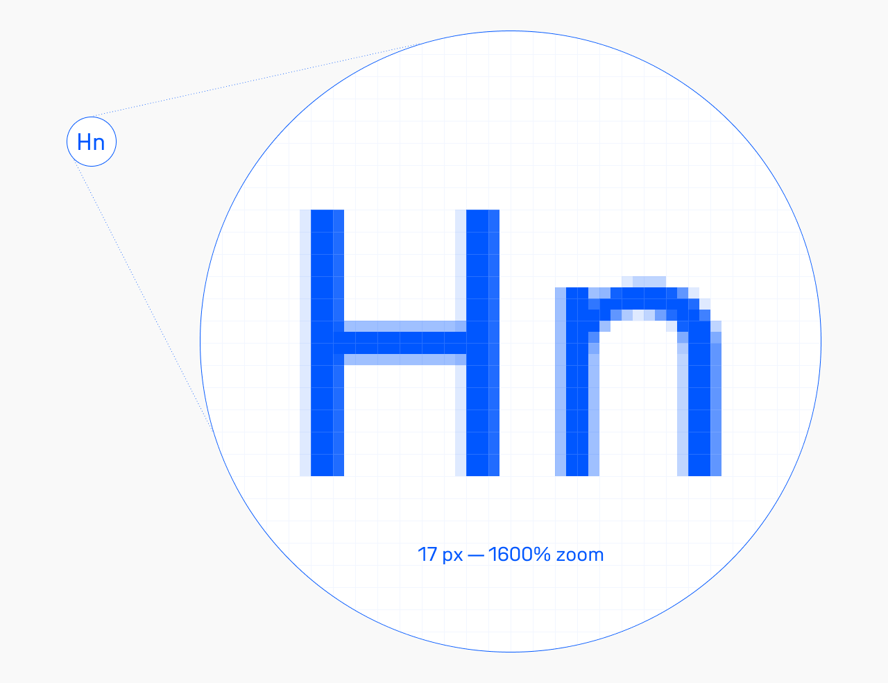
Unifora is built around a 17 px baseline: at that size, capital letter heights align precisely to the pixel grid, giving strokes clean, sharp edges with no sub-pixel blur.
These font-size/line-height pairs keep cap heights on the grid across sizes:
| Font size, px | Line height, px |
|---|---|
| 8.5 | 10 |
| 9.9 | 11 |
| 11.3 | 14 |
| 12.74 | 15 |
| 14.15 | 16 |
| 17 | 20 |
| 18.4 | 21 |
| 19.8 | 22 |
| 21.2 | 23 |
| 22.5 | 24 |
| 24 | 25 |
| 25.46 | 26 |
| 26.9 | 29 |
| 28.3 | 30 |
| 29.7 | 31 |
| 31.1 | 32 |
| 32.5 | 33 |
| 34 | 34 |
Need more line spacing? Add any even number to line-height (2, 4, 6). That keeps the whitespace above and below the text line balanced, which is what makes text labels sit visually centered on buttons and align cleanly next to icons.
For rem-based layouts, set 17 px as your root font size.
The decimal sizes are a proportional system, not a quirk—they give the rasterizer more accurate information to work with, and the difference in rendering sharpness is visible. Works across all major browsers and operating systems.
Fallback font metrics
To minimize layout shift while Unifora Standard loads, define a tuned Arial fallback using CSS font metric overrides. This keeps line lengths and block heights nearly identical between fallback and custom font, so the swap is imperceptible:
@font-face {
  font-family: 'Unifora Standard Fallback';
  src: local('Arial');
  ascent-override: 93.4%;
  descent-override: 24.2%;
  line-gap-override: 0%;
  size-adjust: 102%;
}
body {
  font-family: 'Unifora Standard', 'Unifora Standard Fallback', sans-serif;
}
For best results, combine this with a preload hint—the fallback metrics handle slow connections, preload eliminates the swap on fast ones.
<link rel="preload"
  href="/fonts/UniforaStandard-VF.woff2"
  as="font" type="font/woff2" crossorigin>
OpenType features: stylistic sets
Square punctuation (ss01)
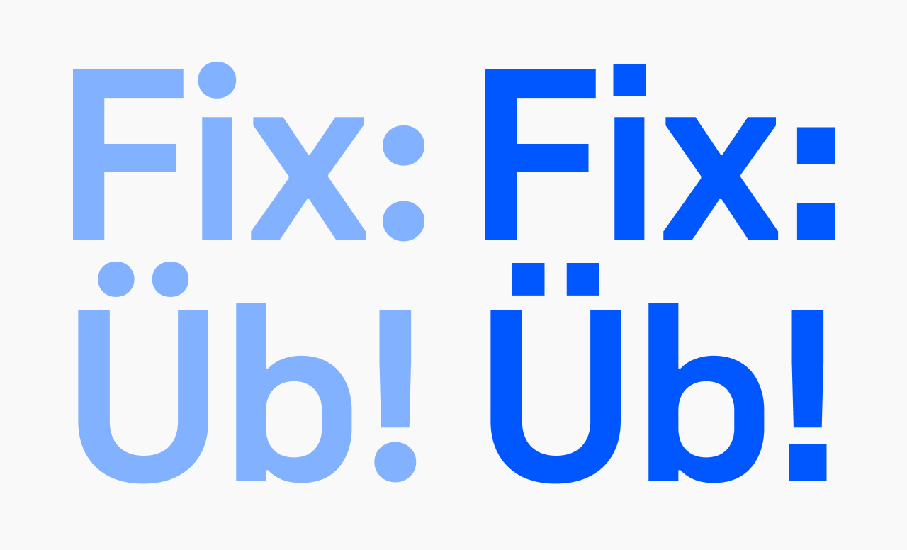
Replaces round punctuation dots (periods, colons, diacritics, exclamation and question marks) with square variants. Pairs with Unifora’s geometric character; useful for technical interfaces and signage where round dots feel out of place.
font-feature-settings: "ss01" 1;
High-legibility set (ss02)
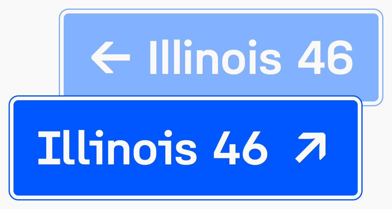
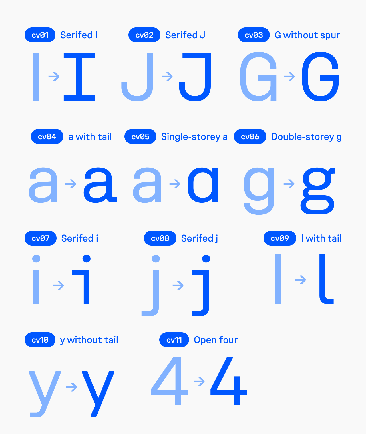
Activates character alternates for disambiguation: serifed uppercase I, serifed J, dotted i and j with serifed stems, l with a tail, slashed zero, open-bowl 4, 6, and 9. Most visible in strings like “Exit 64: Illinois” or “Ljubljana, 49 km”—exactly where a misread character has real consequences.
Recommended for wayfinding, transportation UI, alphanumeric codes, and any display where I/l/1 or 0/O ambiguity is a concern.
font-feature-settings: "ss02" 1;
Open six and nine (ss03)
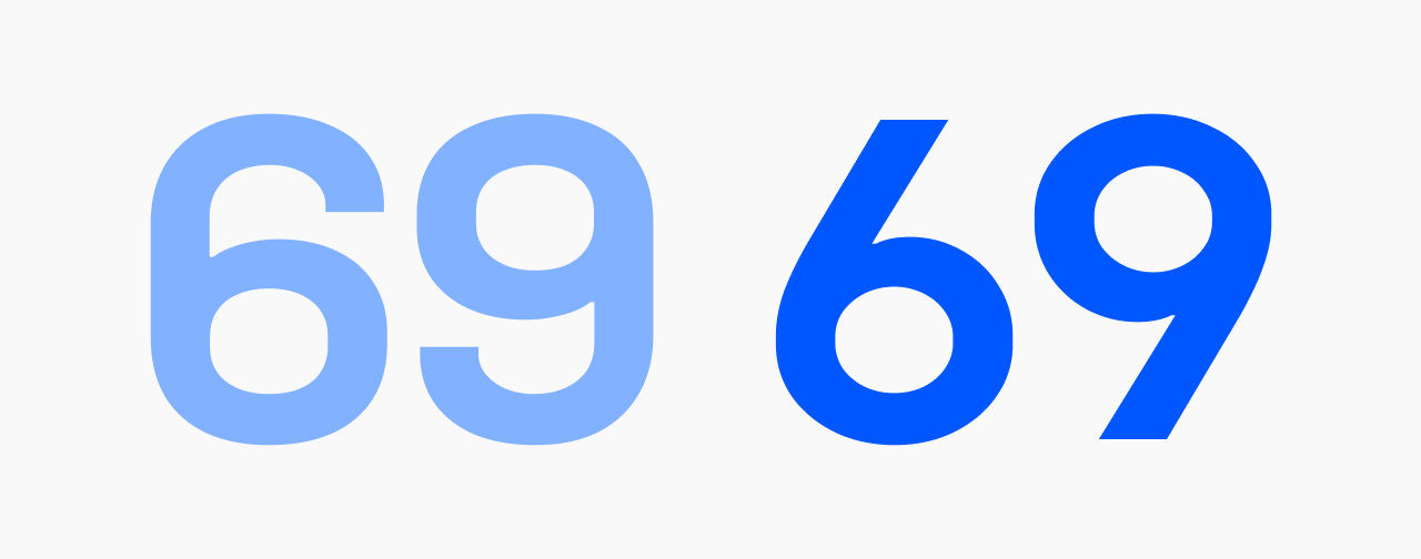
Open-counter 6 and 9. More informal, more legible at small sizes.
font-feature-settings: "ss03" 1;
OpenType features: character variants
Individual alternates, combinable freely with each other and with stylistic sets:
cv01—Serifed uppercase Icv02—Serifed Jcv03—G without spurcv04—a with tailcv05—Single-storey acv06—Double-storey gcv07—Serifed icv08—Serifed jcv09—Lowercase l with tailcv10—y without tailcv11—Open four
font-feature-settings: "cv01" 1, "cv06" 1;
Figures and symbols
Tabular figures (tnum)
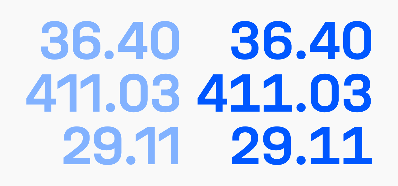
Fixed-width numerals for vertical alignment in tables, dashboards, and timers. Activate globally for any interface displaying numeric data.
font-feature-settings: "tnum" 1;
Slashed zero (zero)
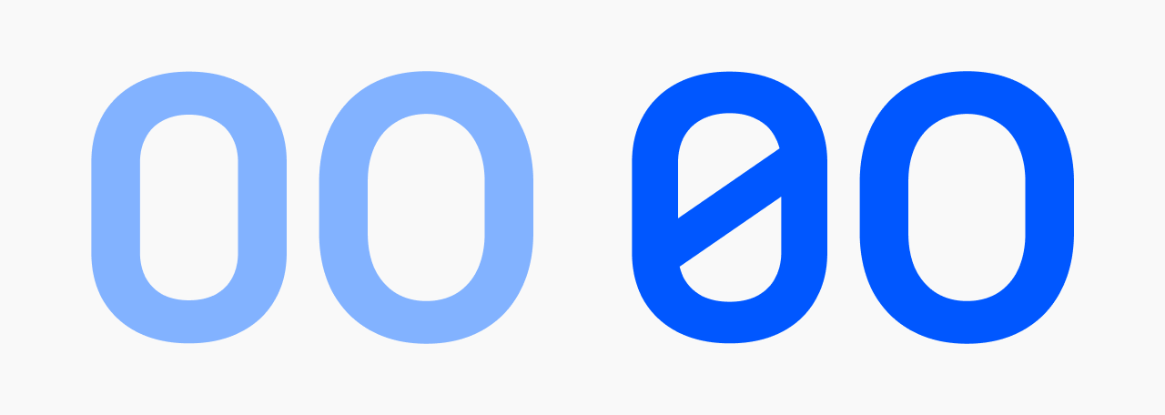
Diagonal stroke through 0 to distinguish it from O. Also included in ss02.
font-feature-settings: "zero" 1;
Typographic features
Case-sensitive forms (case)
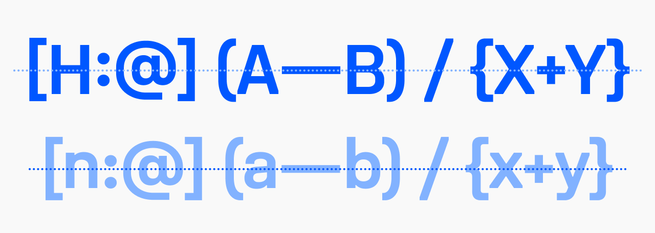
Shifts punctuation (parentheses, brackets, dashes, operators) to optically center with capital letters in all-caps text.
.allcaps {
  text-transform: uppercase;
  font-feature-settings: "case" 1;
}
Discretionary ligatures (dlig)
Includes fi, ffi, fl, ffl, and other optional combinations. Off by default.
font-feature-settings: "dlig" 1;
Ordinals (ordn)
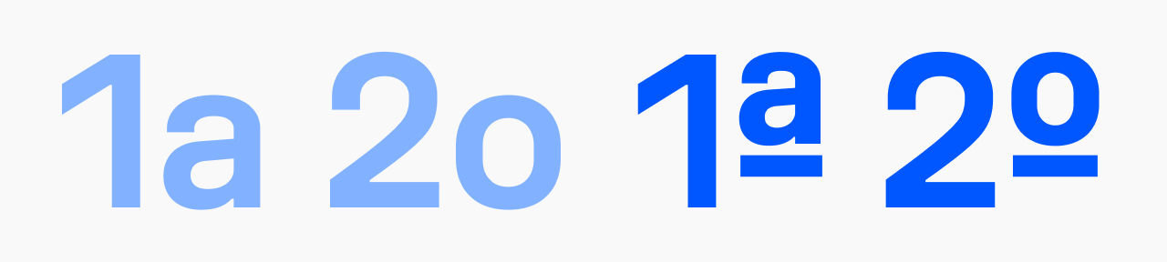
1a → 1ª, 2o → 2º. For legal text, Portuguese or Spanish content, numbered lists.
font-feature-settings: "ordn" 1;
Smart punctuation
All behaviors are automatic—no feature activation required.
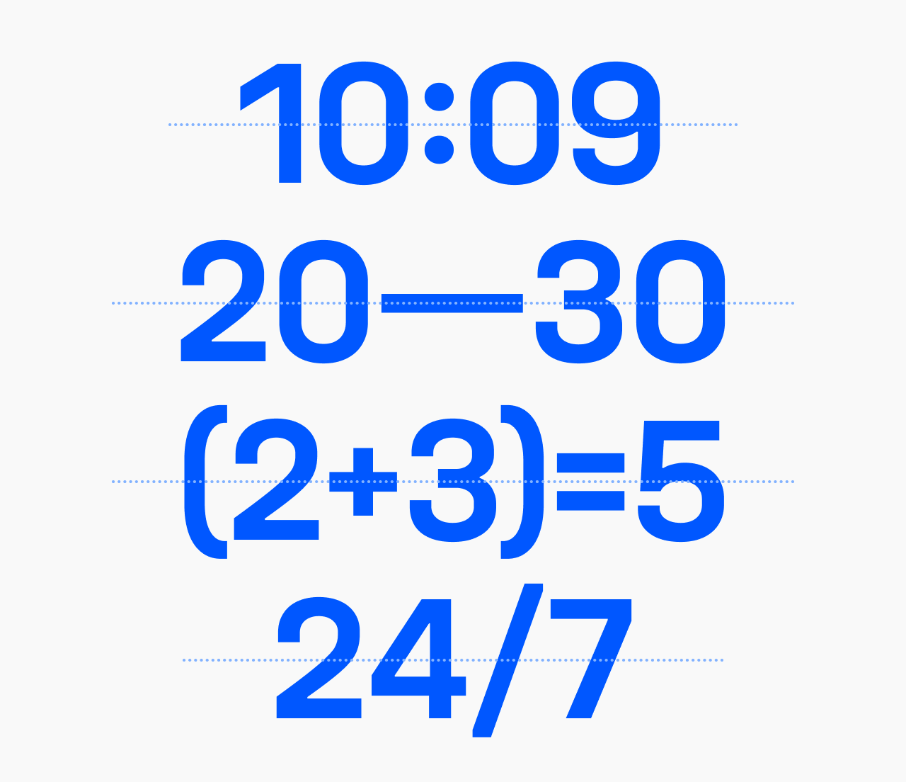
- Time notation. The colon in ‘10:09’ centers vertically at the optical midpoint of the figures, not at the text baseline.
- Numeric punctuation. The hyphen, en dash, and em dash each vertically center themselves against surrounding figures—‘3-4’, ‘20–30’, ‘2024—2026’ all align without manual adjustment.
- Equations. Operators and brackets in ‘(a+b)=c’ or ‘(2+3)=5’ position themselves to align across the full expression.
- Units. ‘km/h’, ‘24/7’—the slash receives correct optical spacing in context.
These behaviors make Unifora particularly well-suited to interfaces mixing prose and numeric content: fintech dashboards, scientific tools, transportation displays.
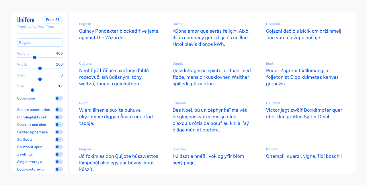
Interactive specimen
The Unifora type specimen covers all 135 named instances across five widths, nine weights, and three slant positions—plus live controls for all three variable axes, every OpenType feature toggle, uppercase mode, and font size. Use it to explore the design space before setting up your implementation, or to test specific combinations—width with slant, high-legibility set with tabular figures, Retalic at extreme weights—directly in the browser.