
Say hello to Innovator Grotesk 1.1! With 2 new stylistic sets and 15 character alternates, this update takes the typeface’s versatility to the next level, making it as adaptable as a chameleon.
 Explore all the new features (even if you don’t own the fonts) using the Innovator Grotesk feature guide.
For the full setup guide — variable font loading, font-variation-settings values, and the complete OpenType feature reference — see the Innovator Grotesk user’s manual.
More case-sensitive symbols
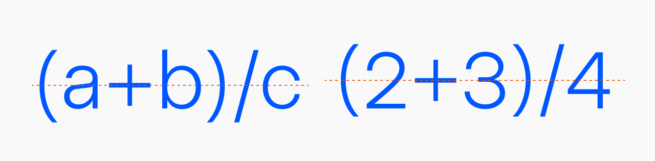
Version 1.1 adds more intelligence to case-sensitive symbols. The font is now smart enough to recognize when you’re typing a mathematical equation, aligning all elements—brackets, math operators, and slashes—with the height of surrounding characters.
For example, if you type ‘(2+4)’, the parentheses and plus sign will automatically align with the taller numbers. But if you type ‘(a + b)’, nothing changes because there’s no need to align with lowercase letters.
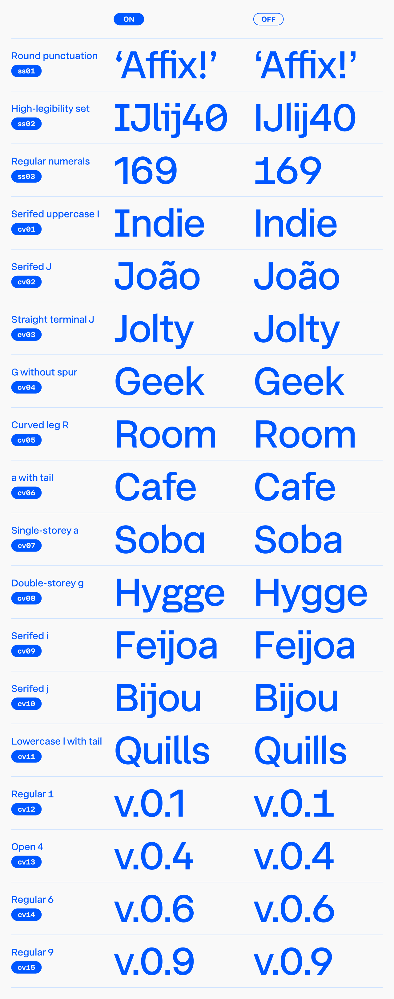
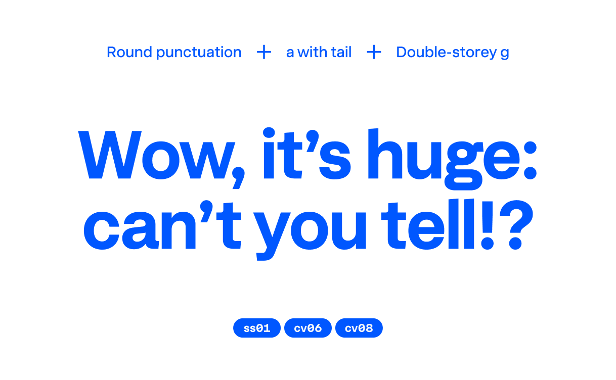
Stylistic set #1: Round punctuation
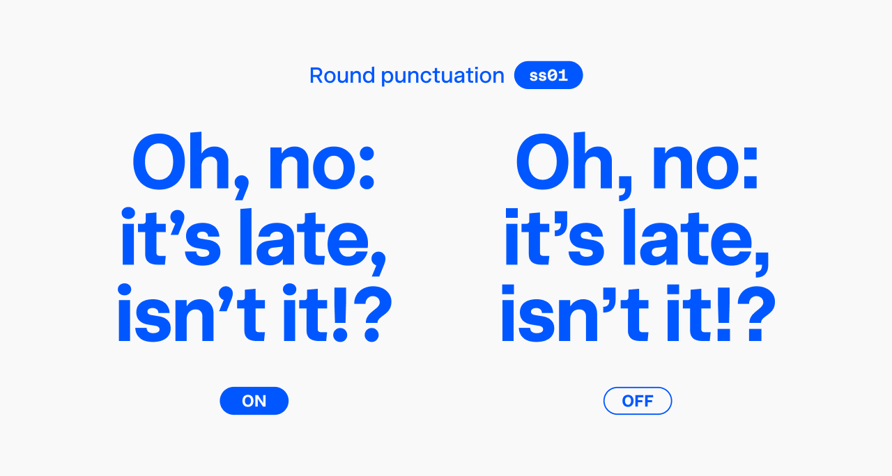
If you prefer fonts with circular periods, commas, and dots above ‘i’, you’ll love this feature. Once activated, you’ll see circular shapes across the character set—suitable diacritical marks, punctuation, and even the division sign.
Important note: In version 1.0, the ‘ss01’ feature controlled the single-storey ‘a’. Version 1.1 introduces a major change: Stylistic set #1 now includes round punctuation, while the single-storey ‘a’ has moved to Character variant #7.
Stylistic set #3: Regular numerals
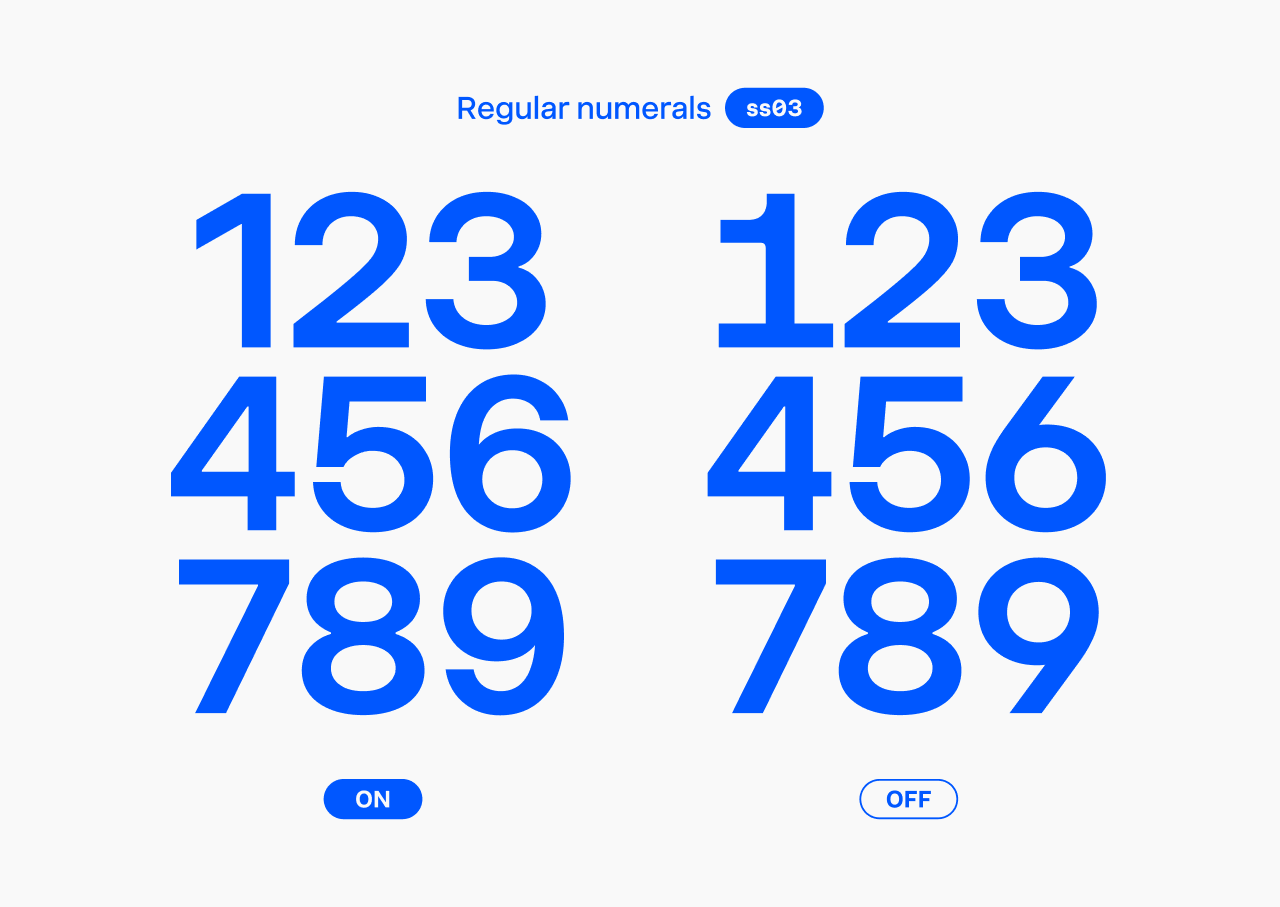
Innovator Grotesk’s signature look comes from its memorable ‘1’ and open ‘6’ and ‘9’. However, when a more neutral numeral design is needed, this feature lets you swap them for their regular forms.
Character variant #1: Serifed uppercase ‘I’
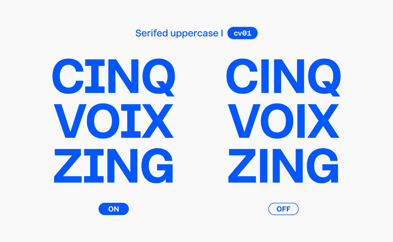
Along with serifed ‘J’, ‘i’, ‘j’, lowercase ‘l’ with a tail, and open ‘4’, this uppercase ‘I’ is part of the High-legibility set (Stylistic set #2).
Character variants allow more granular control. Stylistic set #2 replaces about seven characters at once, but character variants let you replace one character at a time (including related diacritical marks).
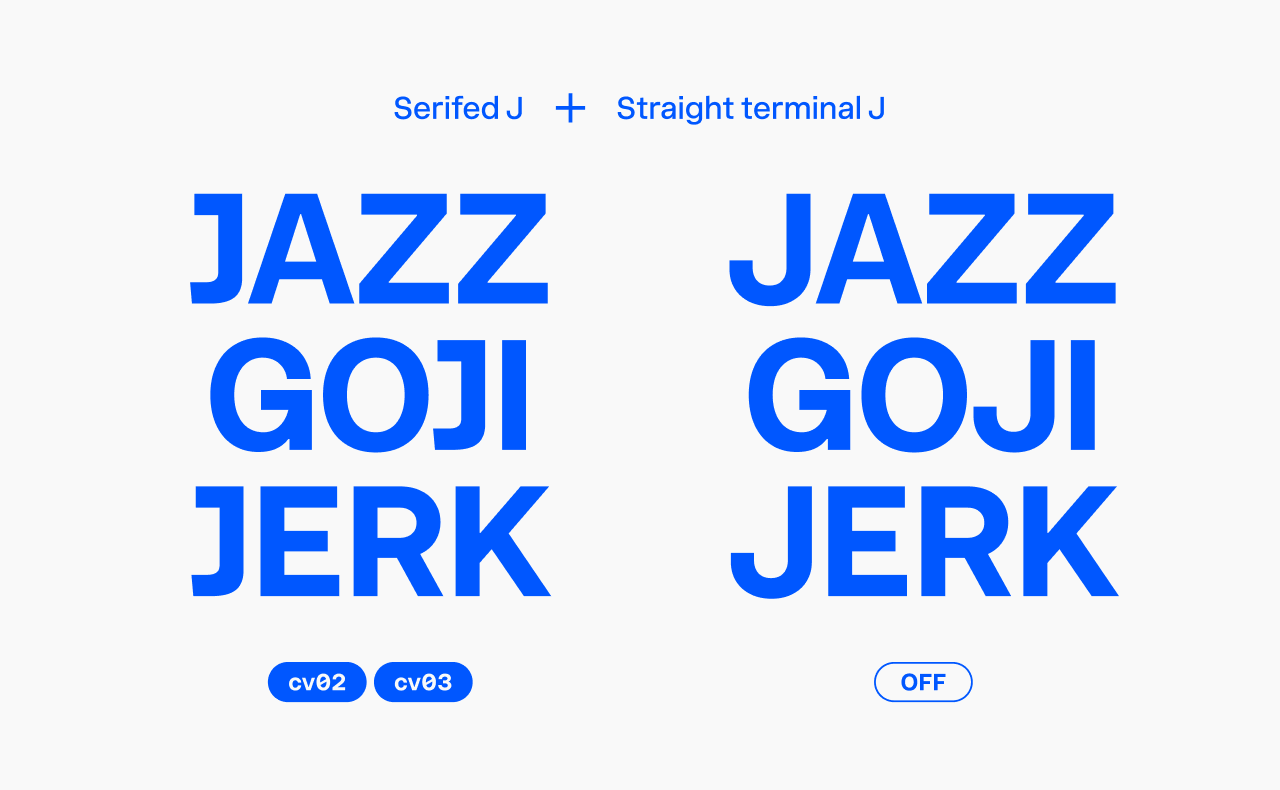
Character variant #2: Serifed ‘J’
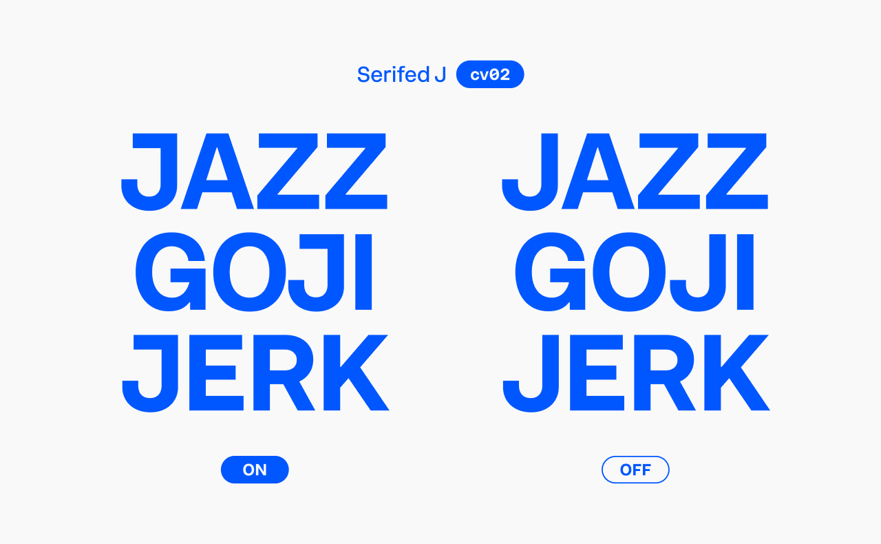
Also part of the High-legibility set, this feature adds a serif to uppercase ‘J’ for improved clarity.
Character variant #3: Straight terminal ‘J’
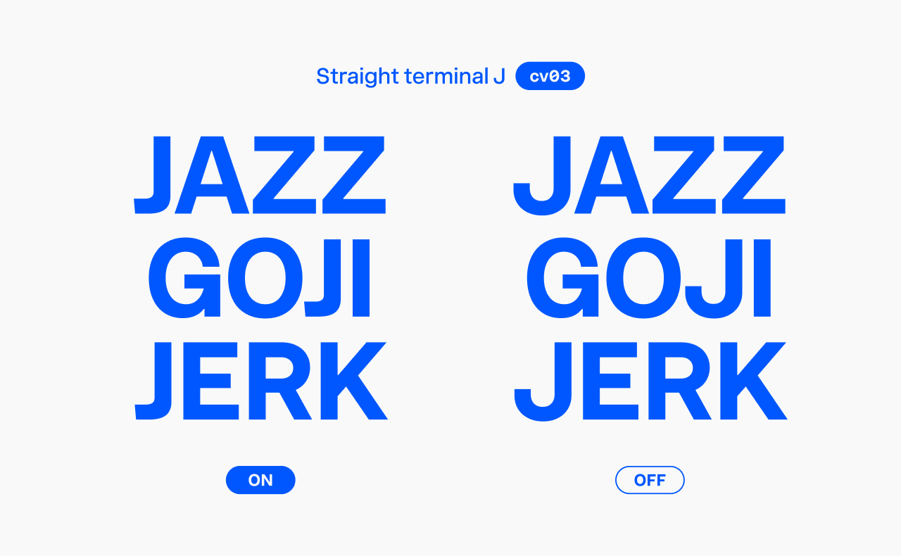
This ‘J’ shape opens up more design possibilities.
Combine it with the previous feature to get a straight terminal serifed ‘J’.
Character variant #4: G without spur
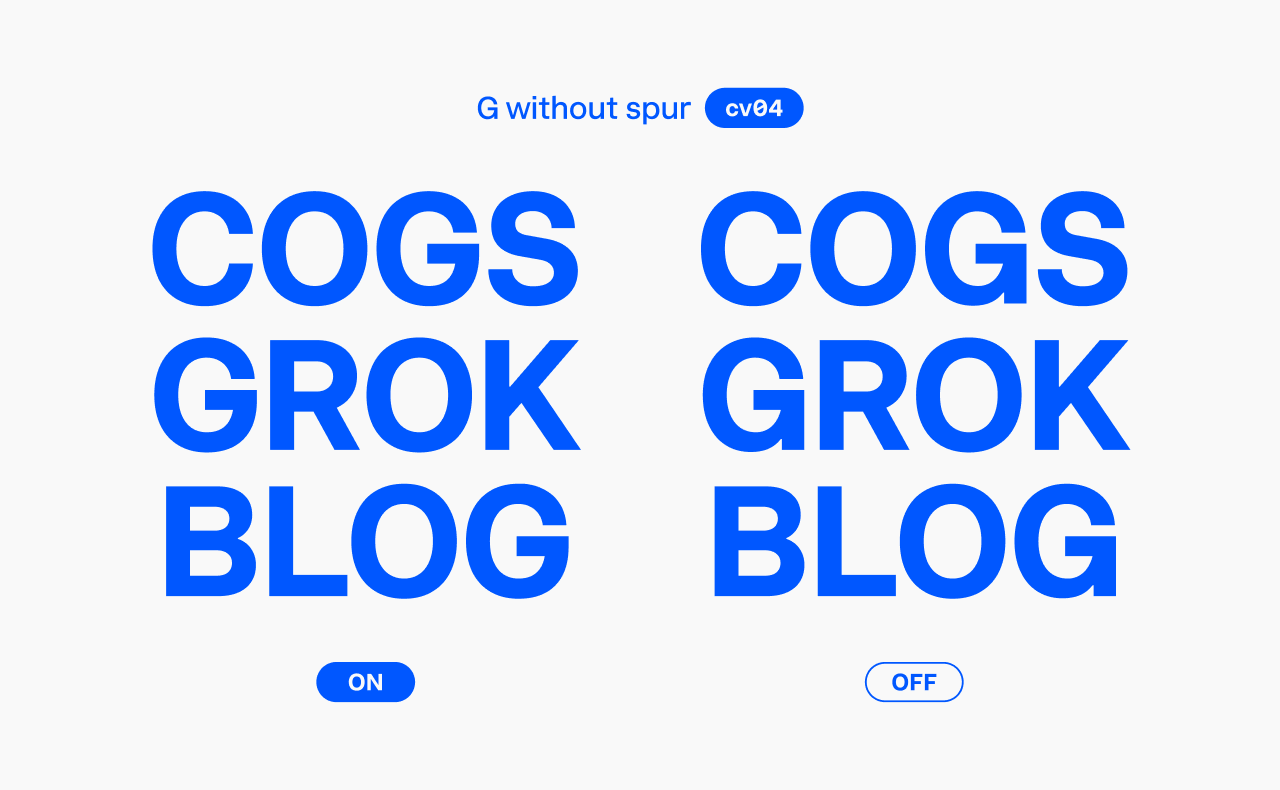
A popular alternative design for the ‘G’.
Character variant #5: Curved-leg R
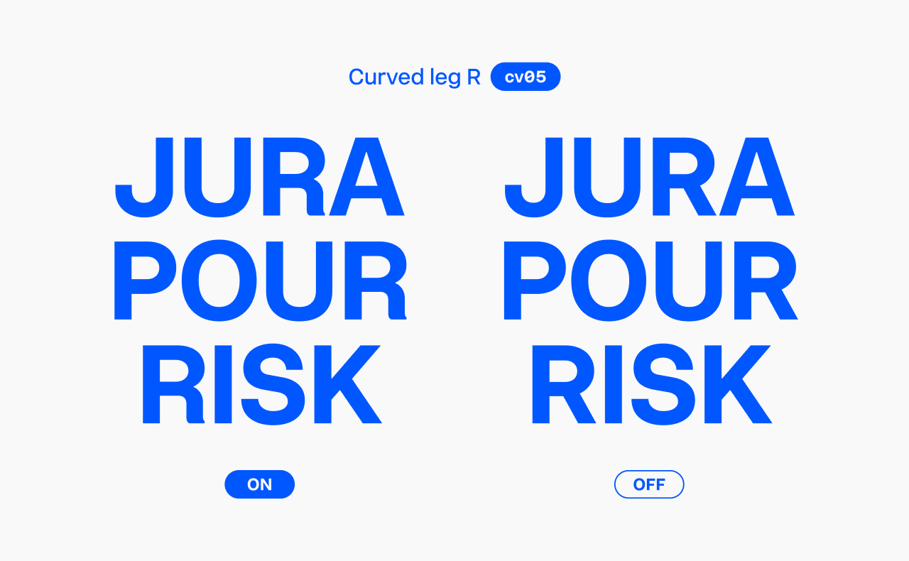
This ‘R’ design mirrors the classic Helvetica-style.
Character variant #6: ‘a’ with tail
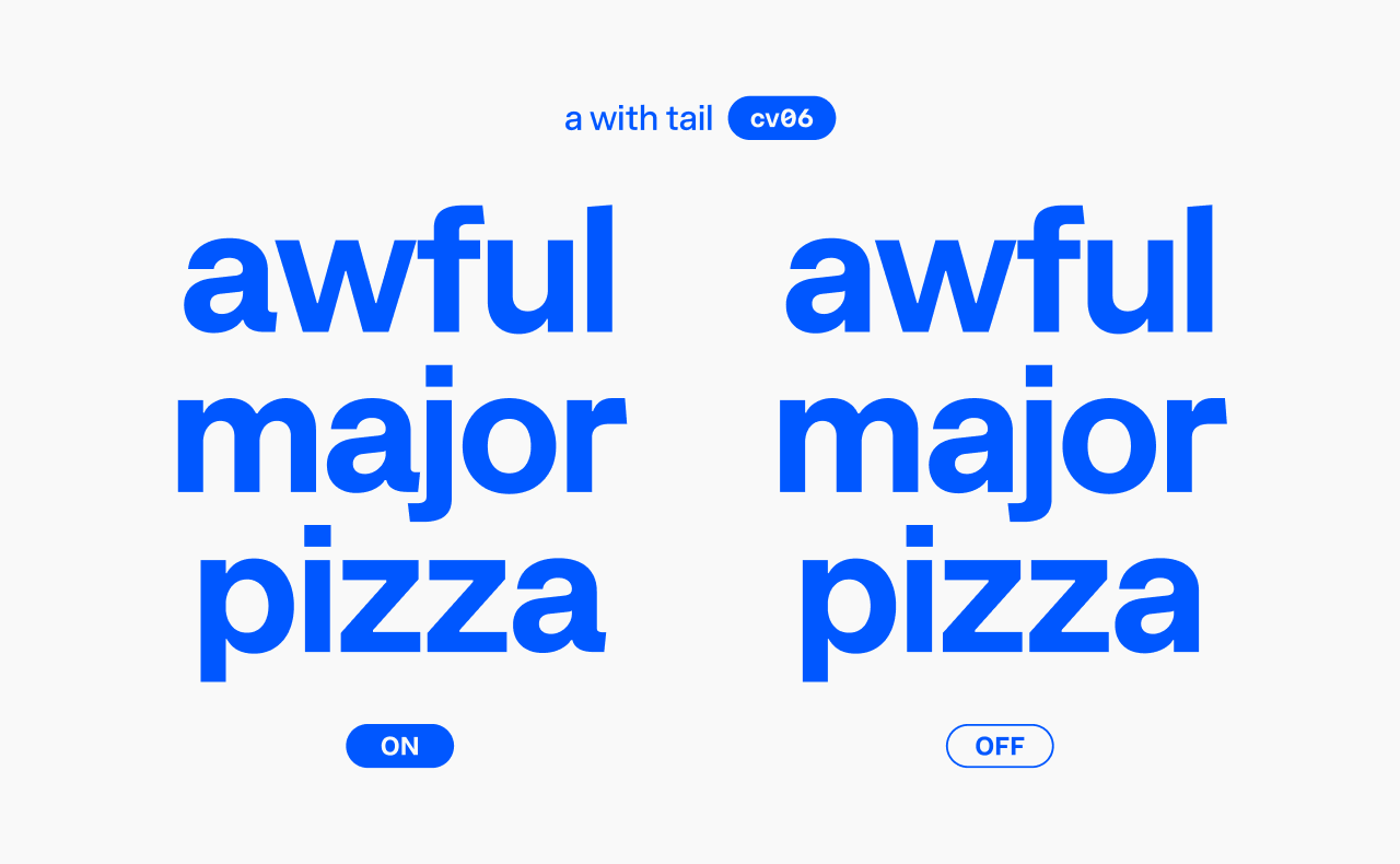
For me, adding a tail to the ‘a’ shifts the font’s vibe a bit towards the “heritage” side of the “heritage—contemporary” spectrum. Either way, it dramatically changes Innovator Grotesk’s overall feel.
Character variant #7: Single-storey ‘a’
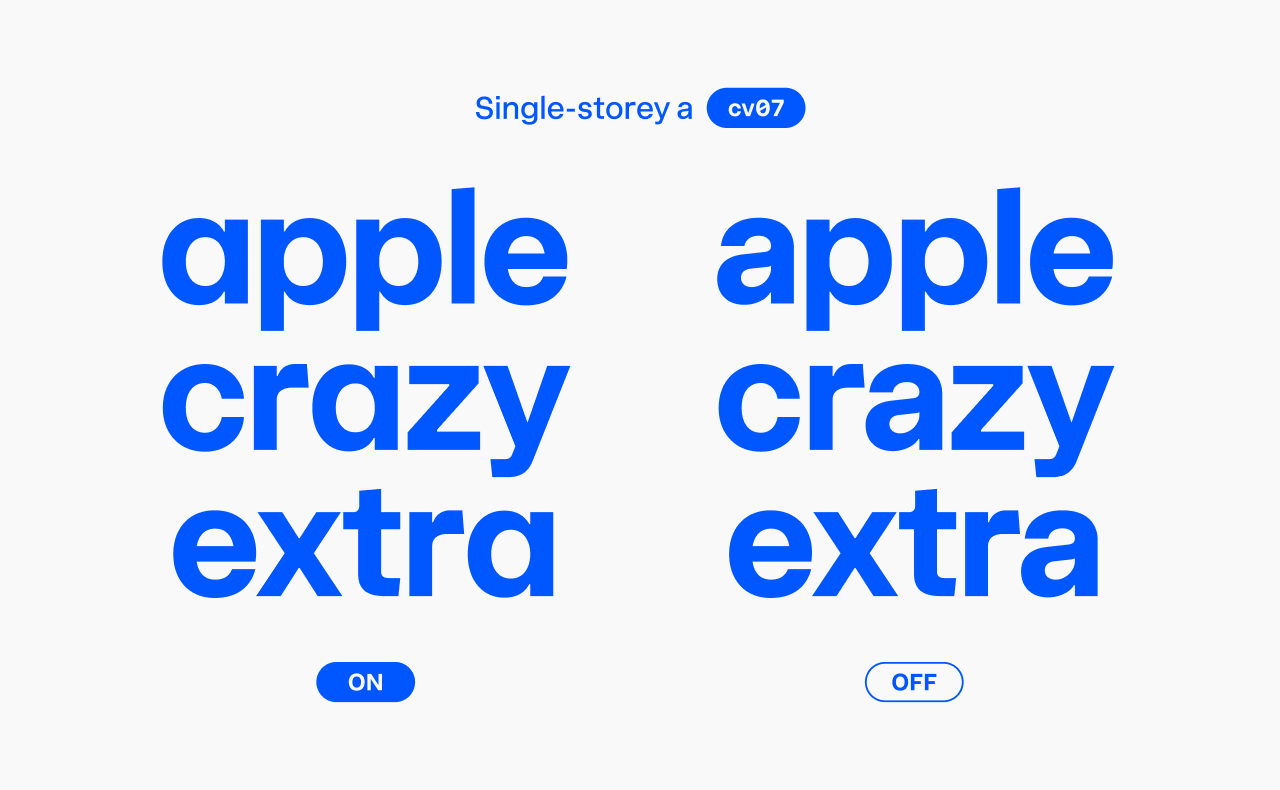
As mentioned earlier, this alternate has moved from the Stylistic set #1 to this variant.
Character variant #8: Double-storey ‘g’
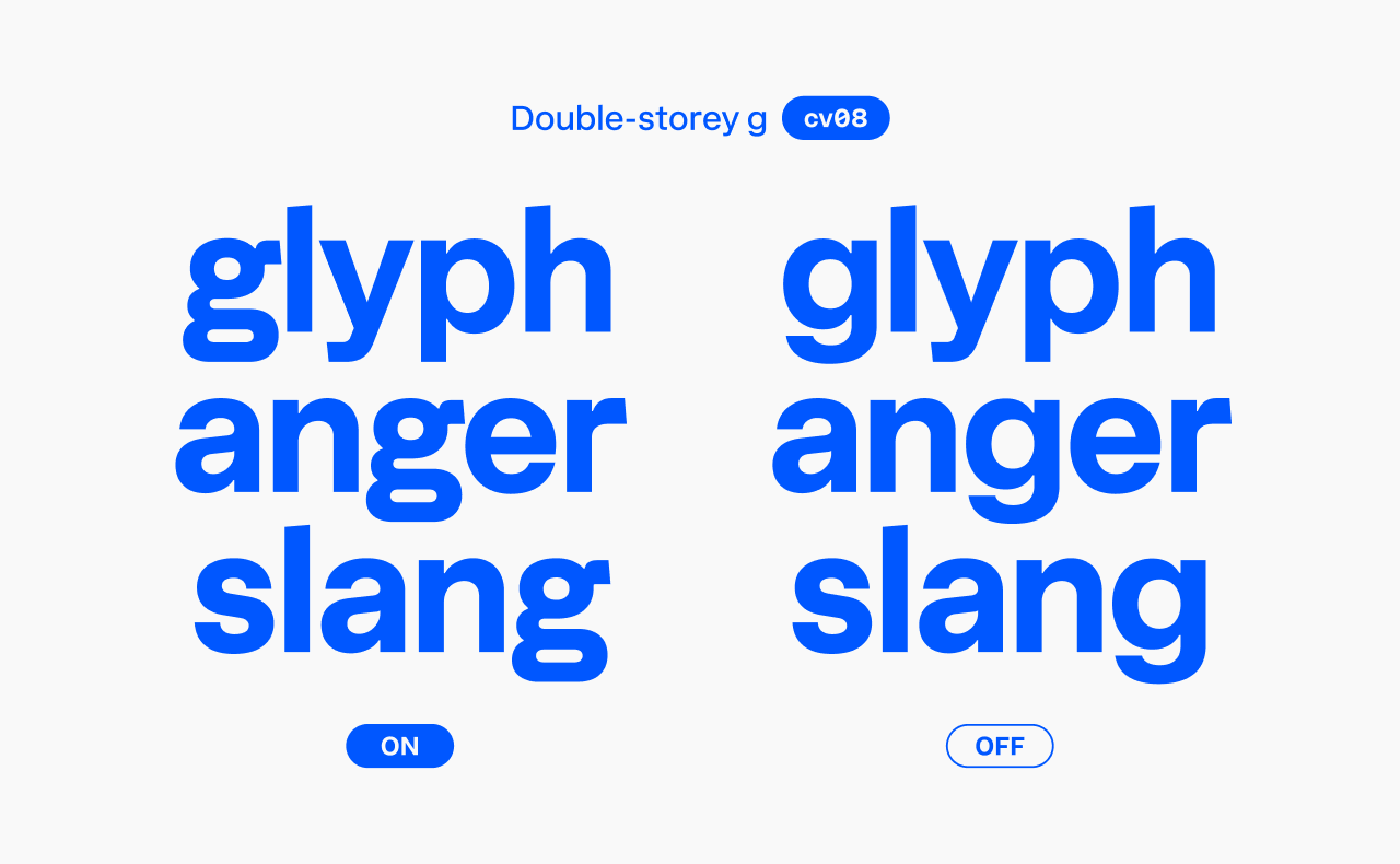
One of my favorite updates! This sophisticated double-storey ‘g’ brings a humanistic touch to the font, softening its technical look.
Character variants #9 and #10: Serifed ‘i’ and ‘j’
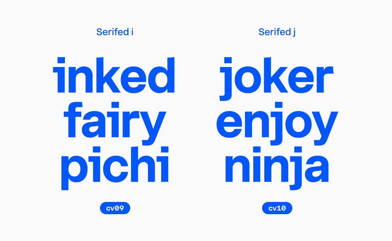
Both are part of the High-legibility set and can be combined with Round punctuation for circular dots.
Character variant #11: Lowercase ‘l’ with tail
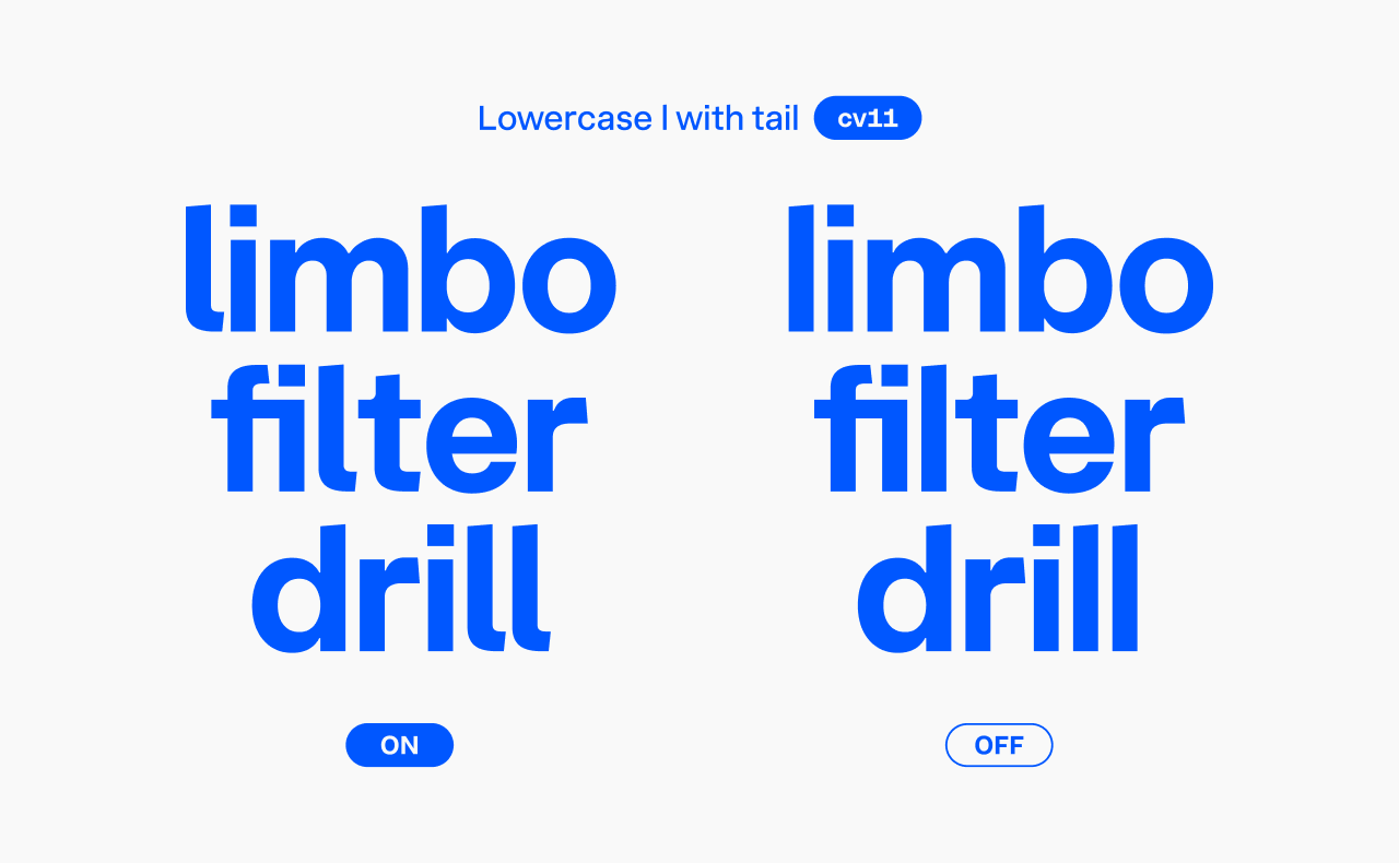
Also part of the High-legibility set, this variant is great when you want to avoid confusion between uppercase ‘I’ and lowercase ‘l’.
Character variants #12–15: Numeral alternates
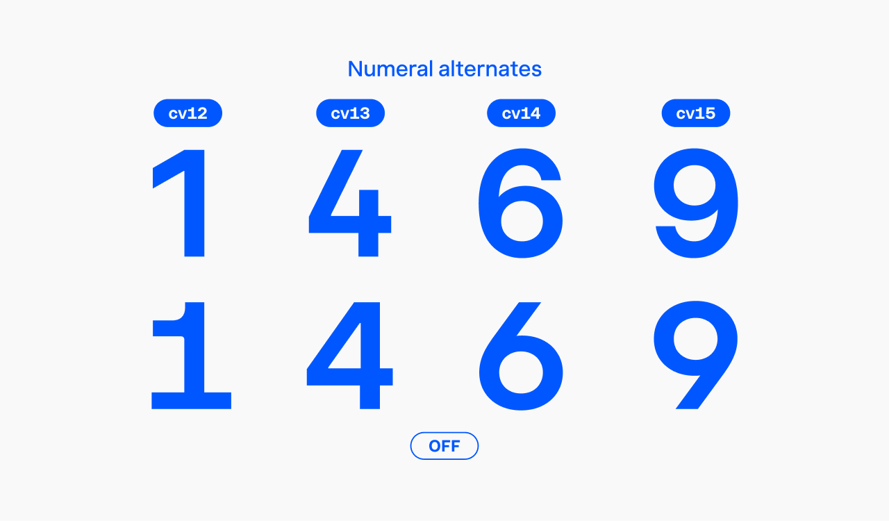
These four character variants cover the regular ‘1’, open ‘4’, and regular ‘6’ and ‘9’. The ‘1’, ‘6’, and ‘9’ are part of the Regular numerals set, while the open ‘4’ belongs to the High-legibility set.
Keep in mind, the ‘1’ has a narrow width, so be sure to enable tabular figures when working with tables or columns of numbers.
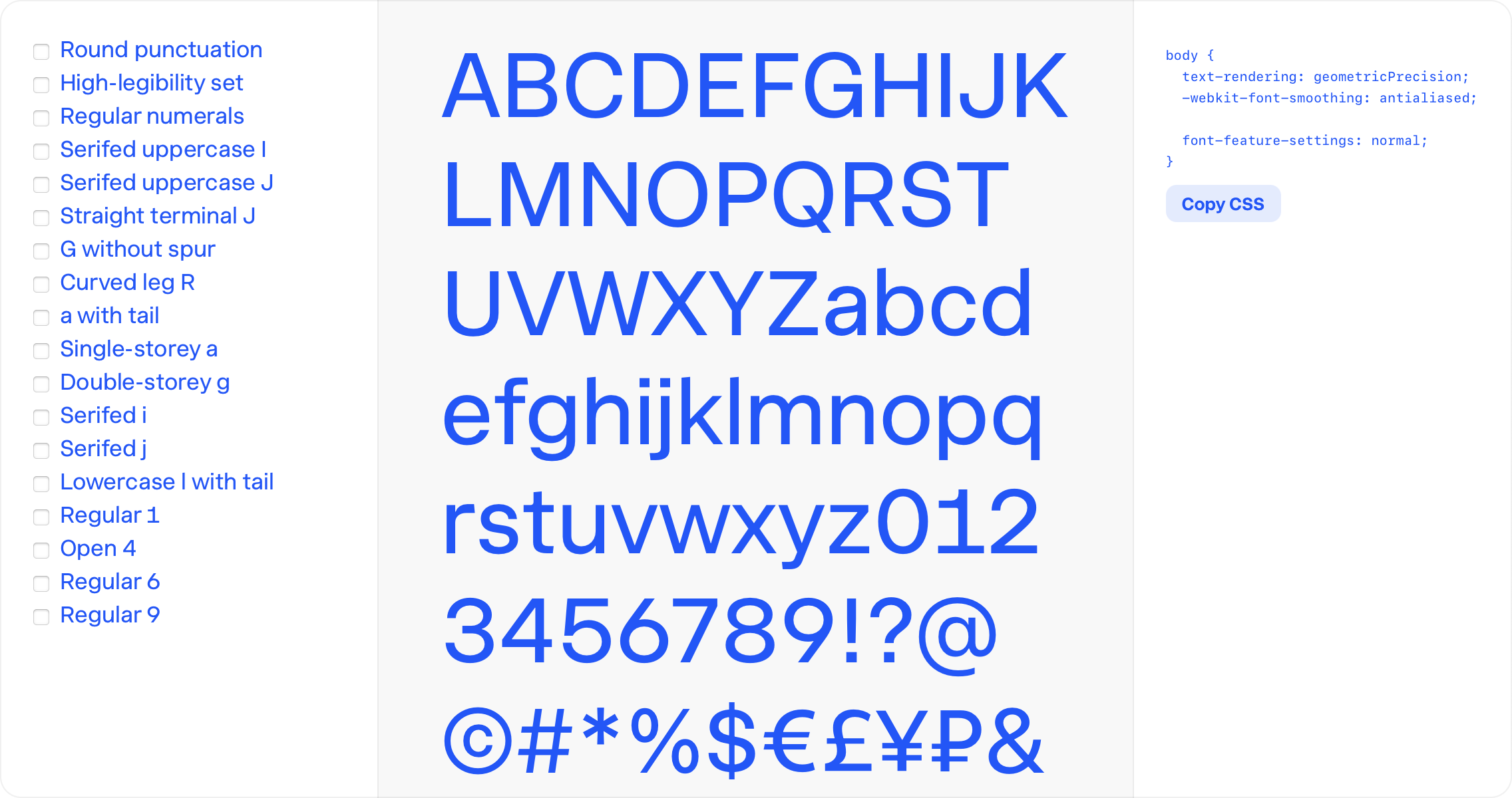
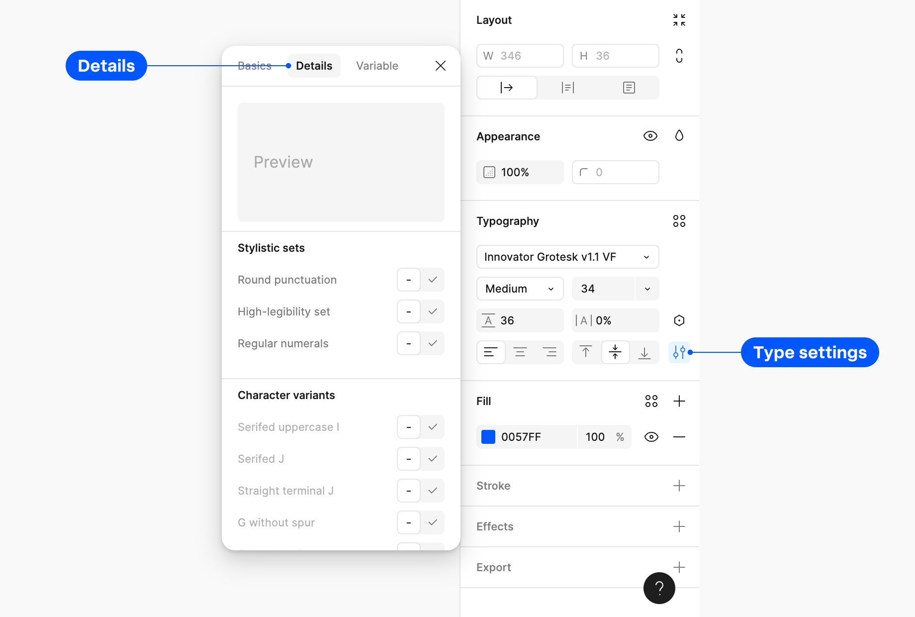
How to access OpenType features
In Figma, simply select your text set in Innovator Grotesk, head to the Type settings in the Typography panel, open the Details tab, and scroll down to find the Stylistic Sets and Character Variants panels.
For CSS, use the font-feature-settings property. Just list the feature codes separated by commas, like this:
font-feature-settings: "ss01", "cv06", "cv08";
If you prefer a more visual approach, use the Innovator Grotesk feature guide tool. Turn on the features you need on the left, and then copy the CSS code from the right panel.